Black Friday. Your LangGraph workflow that personalizes product recommendations is timing out on 8% of requests. The LLMs page says the model is fine. The agent run page says the tool count is normal. So the slow thing is not the model. It is something the model is calling.
The workflow calls 14 services. Redis, Postgres, the vector DB, the pricing API, Stripe, two recommendation services from the data team, three legacy CRUD services from before the rewrite, plus a handful of internal RPC endpoints. Which one of the 14 is slow?
What's new
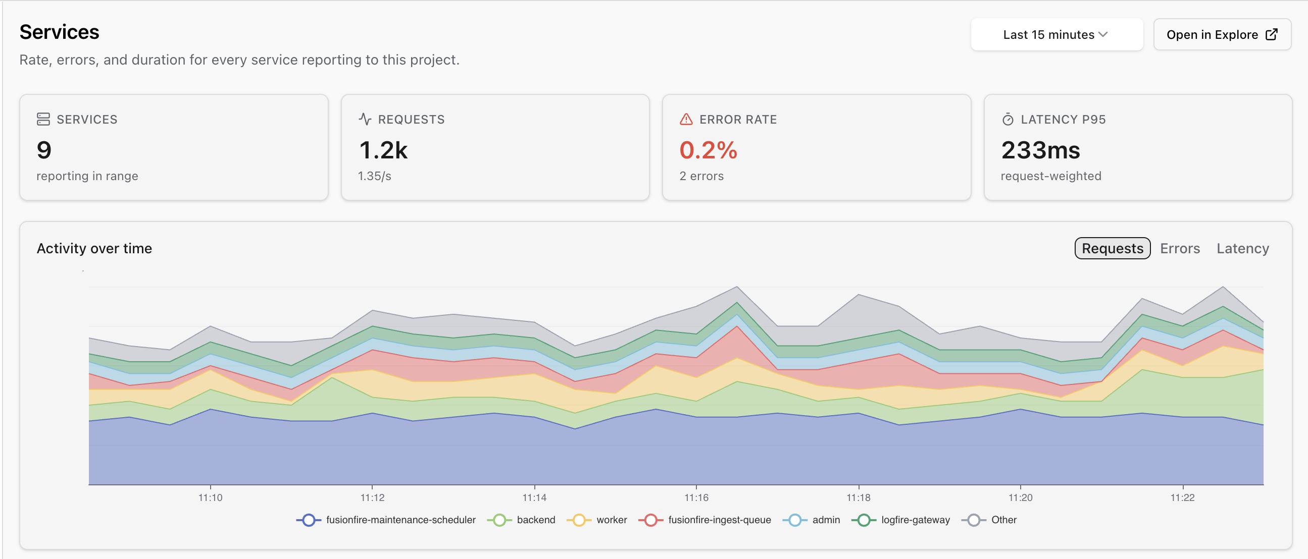
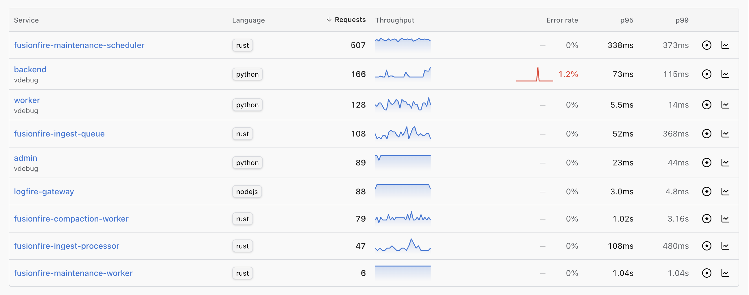
- See every service shipping traces to your project, sorted by whatever metric matters now: requests, error rate, p95, p99 latency.
- Drill into any service for its requests, errors and latency over time, its top operations, its recent deploys, and the most recent failed traces.
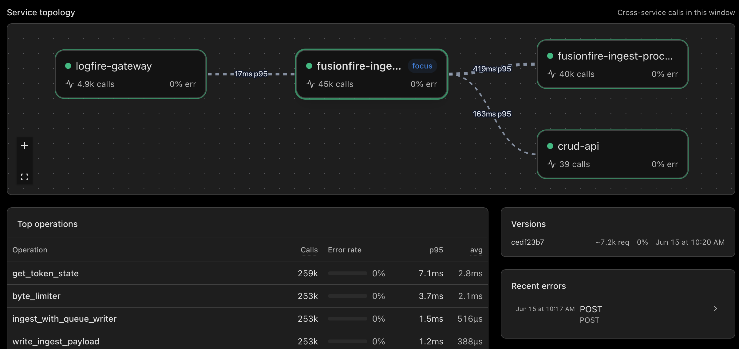
- See what calls what at a glance: the topology graph draws itself from your traces, with the bleeding dependencies colored red.
- See whether a spike in errors or latency lines up with the release that caused it: deploys show as dashed lines on the trend charts.
- Click any node, or any recent failed trace, straight into the live view.
Why this matters
Pydantic Logfire's live view is where investigations end. The right trace, expanded, every span attribute in front of you, the SQL editor one shortcut away. It is the part of the product people are most fluent in, and the part most teams reach for first when something looks off.
That works perfectly when you have five services. At fifty, you have to know which service to filter to before the live view really shines. At five hundred, knowing which one is the entire game. The largest Logfire customers run thousands of services and ship billions of spans a day. For them, the bottleneck is never "I cannot find the trace in the live view." It is always "I cannot find the service the failing trace belongs to."
The Services view is the navigation layer for the live view at that scale. The inventory tells you which service is bleeding. The topology graph tells you which of its dependencies are bleeding. One click on a row, one click on a recent error, and the live view opens on the exact trace that explains it, already filtered to that service.
In our Black Friday scenario, the workflow's detail page shows the topology graph with Redis colored red and the other 13 dependencies in neutral. The top of the Recent errors panel is a trace where the Redis call took 11 seconds. You click it. The live view opens with the slow Redis span already expanded. The path from "8% of traffic is slow" to "this exact span is the reason" is three clicks.
Service maps are not new. What is new is that ours is not a separate product, and it is not aimed at a separate audience inside your team. It is the index for the live view you already use, sharing the same trace ID space and the same SQL, one click away in either direction. The topology graph that other vendors put behind an Enterprise SKU is on every Logfire plan.
The graph is drawn straight from your traces: an edge wherever a span's service.name differs from its parent's. RED counts come from service entry spans, not every span in a trace, so a service nested four hops deep in a long call chain still gets honest request and error rates.
Getting started
The Services view is live for every Logfire project. If you are already sending OpenTelemetry traces, the inventory populates within a minute or two. The topology graph fills in as soon as you have a request that crosses a service boundary.
In our Black Friday scenario, the answer arrives in three clicks. Sort the inventory by p95. Open the workflow. Click the failing Redis span in the live view. Redis cache warming did not fire for the new promo campaign. Push a fix. Cache hit rate back to normal in five minutes.
Not using Logfire yet? Get started. The free tier includes usage up to 10 million spans, our AI Gateway, and so much more.
