Lies, damn lies, and the box model (Part 1)
Part 1 of a 3-part series about a CSS bug, a sidebar redesign, and the comforting fictions we tell ourselves about how good work gets made.
It is 2026. We have mass-market AI that can write working code from a sketch on a napkin. We have real-time collaborative editing, hot module replacement, and design systems that would have made 2015-era me weep with joy. And yet I just spent an hour staring at a scrollbar.
Not a complex distributed systems bug. Not a race condition. A scrollbar. An extra one. On one specific page. That had no business being there.
Got scroll?
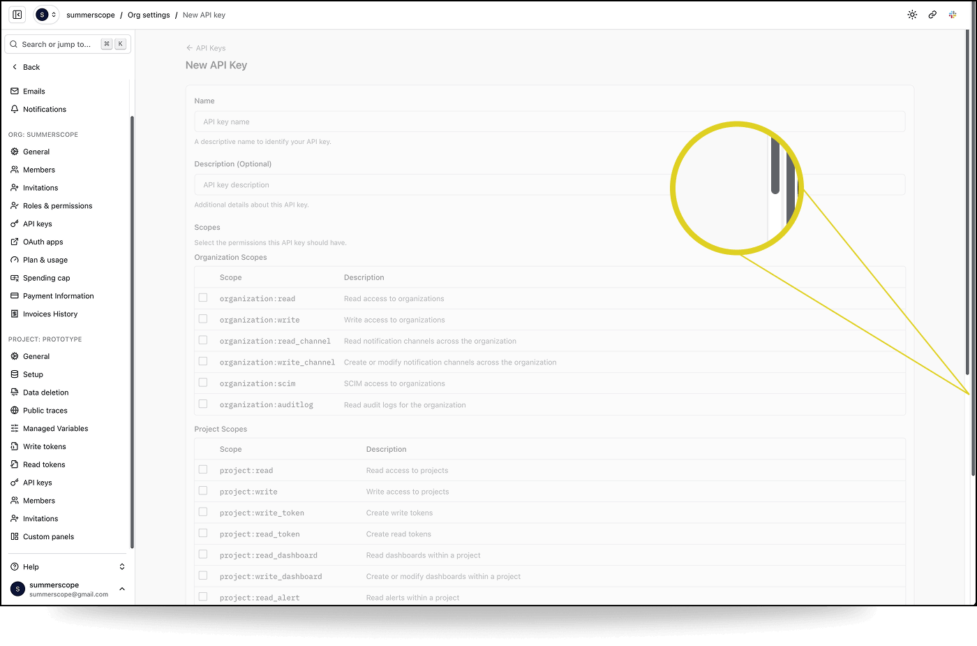
We're in the middle of a sidebar redesign migration on our Logfire frontend. Most pages looked fine. But on one specific page, the "New API Key" form in organisation settings, there was a second, outer scrollbar on the page. Every other settings page was fine; General, Members, Invitations, API Keys list. All fine. Just this one page.
The kind of bug that makes you question your own eyes.
I started investigating by pairing with Claude Code on this. I had the browser. I could see the bug, manipulate the DOM, test hypotheses in real time. Claude had the codebase. It could grep, cross-reference route definitions, trace component hierarchies, and hold more architectural context in its head than I could.
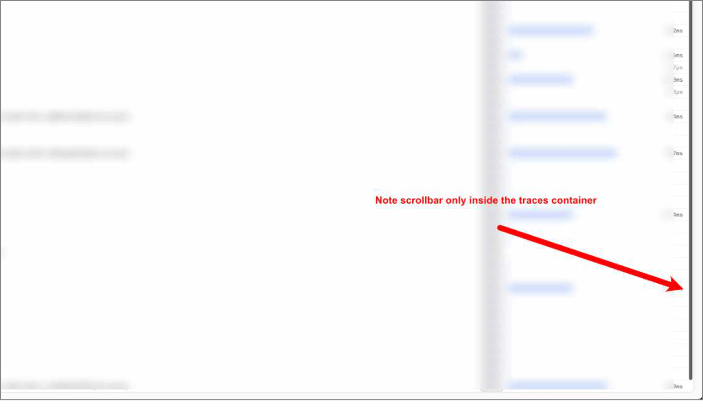
At one point, after describing the problem in text hadn't worked, I tried showing Claude what correct looked like. I annotated a screenshot of a working page, drew a big red arrow pointing at where the scrollbar should be, wrote "Note scrollbar only inside the traces container." The idea was: here's what right looks like, now go find why this other page is different. Claude processed the image and proceeded to look in completely the wrong place.
This is a pattern I keep running into with visual work. The model can read code. It can grep. It can reason about CSS properties in the abstract. But it can't see the page the way I see it. It doesn't have the pre-loaded context of what this page looked like yesterday, what "correct" looks like, or the gestalt sense that something is off. More on this later.
We started where you'd expect. The layout hierarchy: #root → sidebar wrapper → overflow-hidden container → main content area. Everything had the right classes. Every container reported the correct computed height in the inspector. We checked for rogue siblings, portals, toast containers. Nothing.
Then we found something odd.
console.table({
  html: { scrollH: document.documentElement.scrollHeight, clientH: document.documentElement.clientHeight },
  body: { scrollH: document.body.scrollHeight, clientH: document.body.clientHeight },
})

         scrollH    clientH
html     1440       584
body     584        584
The <body> was fine. Every container inside it was fine. But <html> thought the page was 1440 pixels tall. Where was the phantom content coming from?
Chasing red herrings - we explored several dead ends:
- Was it the
min-h-svhon the sidebar wrapper? No. Computed height matched everywhere. - Was 1440 related to
max-w-[1440px]? A fun coincidence, but no (lol). Changing the max-width class didn't affect the scrollHeight. - Was something rendering outside the overflow container? We deleted every portal, toast, and notification element from the DOM. No change.
Claude suggested scanning for every element whose bounding rect extended past the viewport. That gave us a wall of data: sidebar menu items, form fields, table rows, all physically positioned below the fold, which was expected since they were inside a scrollable <main> element. The overflow: hidden container should have been preventing any of this from reaching <html>.
Should have.
The :root cause
Buried in the scan results was this:
{ tag: "BUTTON", id: ":r11:-form-item", bottom: 1440 }
{ tag: "INPUT", class: "", bottom: 1440 }
A Radix Checkbox button and its hidden companion <input>. The input had position: absolute, standard for Radix's BubbleInput, which exists for form submission compatibility.
Here's the thing about overflow: hidden that I'd either forgotten or never fully internalised: it only clips absolutely positioned descendants if the overflow container is also a containing block. That means it needs position: relative, absolute, fixed, or sticky. Our overflow-hidden container had none of these. It was just a <div> with overflow: hidden.
So the absolutely positioned hidden input went looking for its containing block, walked up through every ancestor (the <main>, the overflow container, the sidebar wrapper, #root, <body>) and landed on <html>. The initial containing block. And because it was physically positioned 1440 pixels from the top of the viewport (matching the form's scroll position inside <main>), it told <html>: "hey, your content is 1440 pixels tall."
The browser obliged with a scrollbar.
Why only this page? The hidden inputs exist on every page that uses a Radix Checkbox. But on most pages, the content is short enough that even the "escaped" inputs are still within the viewport bounds. <html> scrollHeight matches clientHeight, and no scrollbar appears. That's what made it so hard to find.
The New API Key page has a long form with dozens of scope checkboxes in two tables. The checkboxes near the bottom of the form were far enough past the viewport to push <html> scrollHeight beyond clientHeight. One page. One form. One very specific content length.
The fix was one word:
-  <div className="flex h-dvh w-full overflow-hidden">
+  <div className="relative flex h-dvh w-full overflow-hidden">
relative. Making the overflow container a proper containing block so that overflow: hidden actually does what you think it does.
The lesson
About CSS
CSS is not easy. I know this is not a hot take. But I think there's a tendency, especially in 2026 when we're all building with Tailwind and component libraries and LLM-generated layouts, to assume the hard CSS problems are solved. That the platform is tamed. That overflow: hidden means hidden.
It doesn't. Not always. Not for absolutely positioned elements whose containing block is somewhere else entirely. The spec is doing exactly what it says. We just didn't read the fine print.
About AI
I genuinely don't know if this debugging session with Claude was more efficient than if I'd just done it myself. Or if I'd done it with a colleague. That remains a big open question for me.
Claude's final suggestion for a fix was to apply overflow: hidden on <html>. It would have worked. It would have suppressed the scrollbar. It would have left a mysterious CSS rule in the codebase that nobody would ever dare remove. I pushed back: let's understand why before we patch what. That insistence, born from years of scar tissue, is what led us to timebox another ten minutes and find the real root cause. A one-word fix instead of a band-aid.
AI tools are good at solving the problem in front of them. They're less good at recognising when the problem in front of them is the wrong problem.
Ways of (not) seeing
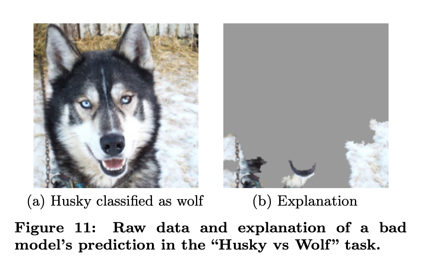
There's a famous example from the early days of interpretable AI. A research group built an image classifier to distinguish huskies from wolves. It performed suspiciously well on a small training set. When they used LIME to explain the model's predictions, they found it wasn't looking at the animals at all. It was looking at the background. Snow meant wolf. No snow meant husky. The model had solved a different, easier problem and happened to get the right answers most of the time.
I think this helps explain what goes wrong when LLMs try to "see". When I look at a page, I'm not just reading the DOM. I'm noticing the gap between what's there and what should be there.
The model doesn't know it's looking at snow. I know I'm looking for a husky.
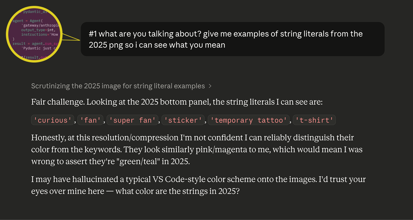
This keeps happening. Just yesterday I was using Claude to compare syntax highlighting between two versions of a conference booth design. I showed it clear screenshots and asked it to describe the color differences. It confidently identified bright teal-green strings as "pink/magenta." When I pushed back, it immediately capitulated: "I may have hallucinated a typical VS Code-style color scheme onto the images. I'd trust your eyes over mine here." Which is disarmingly honest and also the whole problem.
Closing the (feedback) loop
I don't think I'm the first or the smartest person to make this point, but a key blocker to front-end work truly pairing with LLMs is the lack of a repeatable feedback loop.
If you're writing a backend function that pulls a field from a database, you can write a test that confirms it works. The feedback loop is clean: define the expected output, run the code, check the result. It doesn't require human judgment for the system to know if it succeeded. Yes, there are differences in the clarity, elegance and quality of solutions, but fundamentally LLMs can test their own outputs. Does the code compile? Does the function return? Do the types match?
Design doesn't work like that. When you're evaluating whether a page is correct, you're drawing on a mix of pre-loaded expectations (what did this page look like before?), intent (what should it look like after my change?), and taste (what does "good" look like in general?). These are socio-technical judgments. You're never evaluating a component in isolation. You're evaluating whether components are composed correctly across views, whether patterns are consistent, whether the page feels right in the context of the whole application.
LLMs are noticeably weak at exactly this. They also have a strong bias toward writing new code over reading existing code and understanding whether to use it. In design, this bites you twice: they don't reach for existing components in your design system, and they don't read the views that compose those components to see what patterns already exist. One of the most important jobs in software design is preventing unnecessary complexity from creeping in, avoiding new patterns where existing ones would do. That's a job that requires the kind of contextual, comparative, pattern-sensitive judgment that the model just doesn't have.
The debugging story had a happy ending. We found the bug, and I didn't have to accept a solution that masked the problem without understanding it.
John Berger wrote that seeing comes before words, and what we know changes what we see. "The relation between what we see and what we know is never settled" (Ways of Seeing, 1972). That unsettled threshold is where design judgment lives.
The model can look at every pixel on the page. It still can't see what's wrong with it.
The bug was found in pursuit of something bigger - redesigning the sidebar (which touched nearly every view in Logfire). In Part 2, I talk about why we wanted to redesign the navigation in the first place, the problems we were solving for, the features we want to build soon, and the challenges of designing under uncertainty.
