Lies, damn lies, and the box model (Part 2)
Part 2 of a 3-part series. In Part 1, I got owned by a scrollbar.
The sidebar was controversial before it existed.
There was some resistance (I'm looking at Samuel) to the idea of a sidebar at all. We'd gone back and forth about whether we could get away with extending the top nav, or stacking multiple layers of horizontal navigation, something more like GitHub's page layout. But Logfire has a lot of application-like qualities, and the top nav was running out of room. So as the existing pattern continued to show its age, the appetite for the project eventually hit a tipping point internally.
And then when I got the go-ahead, I had a minor freak-out. I'd been thinking about it and wanting to do it for so long that when the moment came, it felt high stakes. That didn't help.
Round one
Running out of space
Here's what Logfire looked like before:
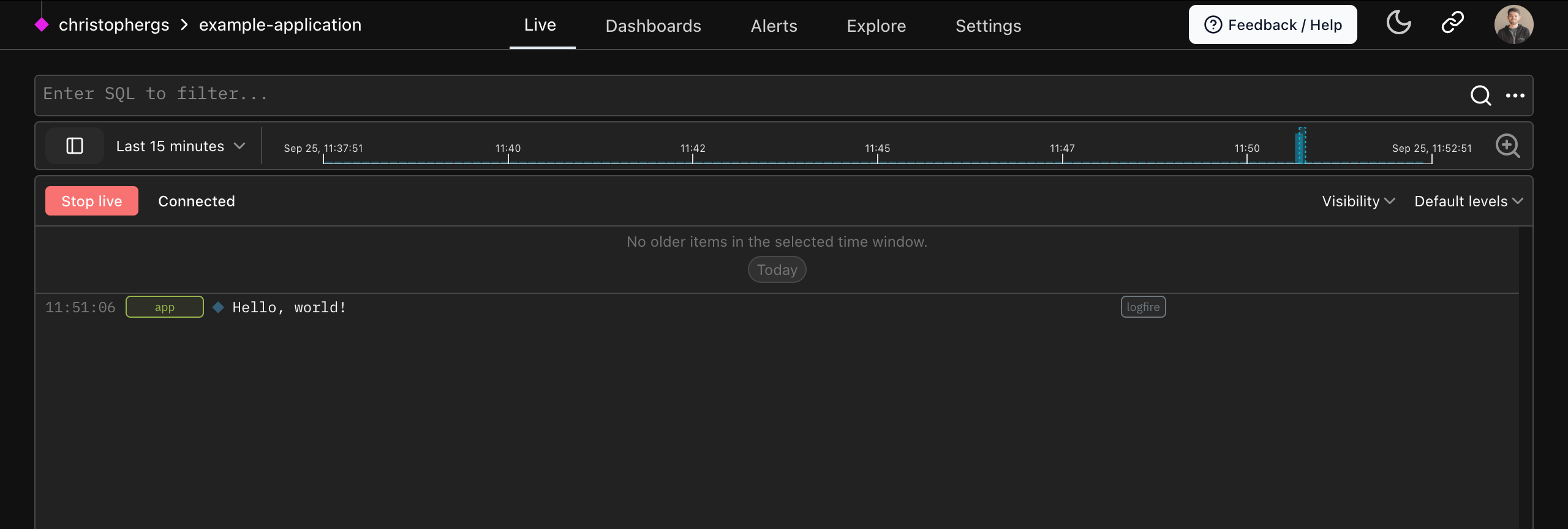
The horizontal nav couldn't keep up. What started as a handful of views (Live, Explore, Dashboards) had grown into alerting, issues, channels, datasets, an AI Gateway with its own settings, and a sprawling set of org, project, and account configuration pages. Settings had become a maze: some lived under "Project Settings," others under "Organization," others behind the Gateway tab. Users were getting lost. We were getting lost.
On top of that, we knew we had a lot of features coming. We're in the middle of building out observability for AI: evals, data annotation, dataset management, agent monitoring. The field is changing fast, and the workflows we're building now might look different in six months. We needed nav that could absorb new items without pulling the rug out from under existing users. We needed space to experiment and potentially walk back our opinions.
The top nav gave us none of that. On a 13" laptop it was already fragile and ugly. We were out of room.
Research, agonising, and picking a pattern
I started by looking at what everyone else was doing. Sentry, GitHub, Linear, Notion, Slack. Competitors in the observability space. I was forming opinions about what I liked and didn't.
Linear and Notion have great sidebars, but they both lean into user-defined menu structures that get cluttered fast. That's the nature of an internal wiki or a task manager. We had a different constraint: we wanted users to be able to bookmark pages and pin views they visit often (comparison pages from eval runs, dashboards, specific alerts), but we didn't want to end up at a Notion-like state where the nav had no opinions at all. Slack's channel grouping does a better job of this, clustering things contextually so you don't get overwhelmed by the sheer volume of navigable space.
I prototyped two or three patterns, a lot of close-but-no-cigar.
Samuel was attached to the idea that the menu should be completely closable. When he's doing a demo on his laptop, he wants a single click to navigate between top-level views. Live to Dashboards. No opening a menu first. This "don't make me click" instinct was a guiding principle, but it sat in tension with keyboard accessibility, general usability, and the reality that a fully hidden menu means users need to remember that the menu exists.
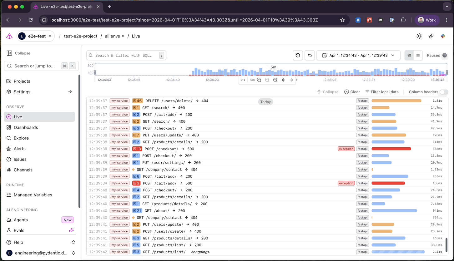
We landed on a collapsible sidebar with three modes: locked open, fully collapsed, and hover-to-expand. The hover mode was an attempt to split the difference. Laptop users get their horizontal space back. Desktop users can lock it open if they want. The menu is always one hover away.
A million small decisions
I was probably naive about the scope. I thought the project was smaller than it was. In reality, the sidebar touched every view in the app. I was redesigning all the page layouts, normalising breadcrumbs, standardising headers, making sure patterns worked across the different kinds of views we have. We built a PageHeader component that replaced around 15 different heading implementations, each with slightly different spacing, alignment, and behaviour. Routes were restructured: Issues and Channels promoted to top-level, Gateway settings pulled out of the generic settings path, so the sidebar could detect context without parsing URL segments with heuristics.
This normalisation work was a high-value secondary effect. A lot of stuff that was inconsistent before is consistent now. But it was a much bigger task than I was giving it credit for when I picked it up.
I'll also say this: in the LLM era, I felt a strong sense of urgency that I wasn't delivering fast enough. Once we'd made the decision to go in a direction, it felt like it should just be done. That's not how it works. There were a million little decisions along the way, and each one needed eyes, judgment, and the kind of contextual knowledge that doesn't come from a prompt.
We built it behind a feature flag, then rolled it out to everyone at once. And users said... nothing. No complaints, no confusion, no support requests. We took that as a good signal. The best navigation is the kind nobody notices.
Round two
And then we started living with it ourselves.
People were excited to have a sidebar. But there was pushback about the fully collapsed mode. When the menu was hidden, you had to remember it was there and know to hover in the right spot. Our FusionFire / database team lead, Adrian, came to me with an idea he'd sketched out using Claude: instead of full collapse, show an icon-only rail.
I pushed back. Hard. My first reaction was that the icons changed between menu states (main nav vs. settings), which meant the rail couldn't work as a persistent spatial map. Users memorise where things are in a navigation. If the icons shuffle depending on context, that breaks.
Adrian's counter was rational: "I expect people to spend a lot of time on the home page and will build a mental mapping to the icons. I don't expect people to spend much time on the settings page. They won't be annoyed by unfamiliar icons there; they'll just hover for a sec and get the expanded view."
I told him to "let me live with it." A few hours later: "I am liking it more as I use it more."
This is the part of the story that I think matters for the broader argument. I had a real design principle (icon rails should be persistent maps for the users' mental model). I held it, tested it against actual use, and walked it back. The reframe was thinking of the rail as a hint rather than a map. It's there to remind you the nav exists, to let your mouse land in the right ballpark before the full menu expands on hover. It's not trying to be the complete navigation on its own. Cmd+B opens and closes it. Cmd+K lets you jump anywhere without touching the nav at all.
This is what giving yourself permission to break the rules looks like. It's scary, and you have to get there from first principles. I didn't throw out the idea of the icons-as-map because I didn't care about it. I threw it out because I could see, from using the product, that the compromise served our users better than the orthodoxy would have.
Designing under uncertainty
For all my kvetching about the real versus perceived scope of work, the hardest part of this project wasn't the implementation. It was making decisions when you know the landscape is shifting.
We're actively building out new feature areas. The evals navigation has already changed once: we started with a flat list of experiments, then moved to a datasets-first concept because that does a better job of clustering experiments by their cases. We'll change it again. The AI observability space is moving fast, and the workflows we're designing for now may not be the workflows that matter in six months.
The sidebar had to accommodate this. Not by being infinitely flexible (that's how you end up with Notion's everything-is-a-page problem), but by giving us a space where we could add new nodes, experiment, and change our minds without confusing existing users. Enough structure to be navigable, enough room to evolve.
This is what "directionally correct" means in practice. The sidebar isn't finished. The evals section will change. The AI features are still taking shape. We're not waiting for everything to be perfect before shipping. We're shipping something that we believe is heading the right way, and we're watching, listening, and adjusting as we go.
There's a broader question we keep circling back to: should we even be thinking about features as standalone views? Or should they be more like mix-ins that can surface across different parts of the application? The playground could live inside evals, inside the agent overview, inside prompt management. Annotations could appear wherever the data lives, not on a dedicated annotations page. There are lots of ways that seeing multiple areas of the application at once could be useful, and the nav has to be flexible enough to support that without turning into a maze.
I don't have an answer yet. We're still exploring. But the sidebar gives us the structural room to try things, and that's what matters right now.
The boring truth is that navigation isn't glamorous. Nobody opens an observability tool and thinks "wow, what a sidebar." But bad navigation creates friction on every interaction, and that friction compounds. Getting this right, making it feel like the tool stays out of your way, is the kind of investment that pays off quietly, on every page, for every user.
We're happy with where it's heading. Not where it's landed. It's not done. That's the point.
If you missed the CSS bug that started this series, have a look at Part 1.
In Part 3, I step back from what it looks like to design something and ask what I should even be designing at all. What is software design in 2026, when the landscape is shifting under our feet? What does it mean to support people in encoding their own opinions into the systems they use? And how did design process become both a ritual and a rod for our backs?
Curious about the new sidebar? Try it yourself! https://logfire.pydantic.dev and see how it feels.
