

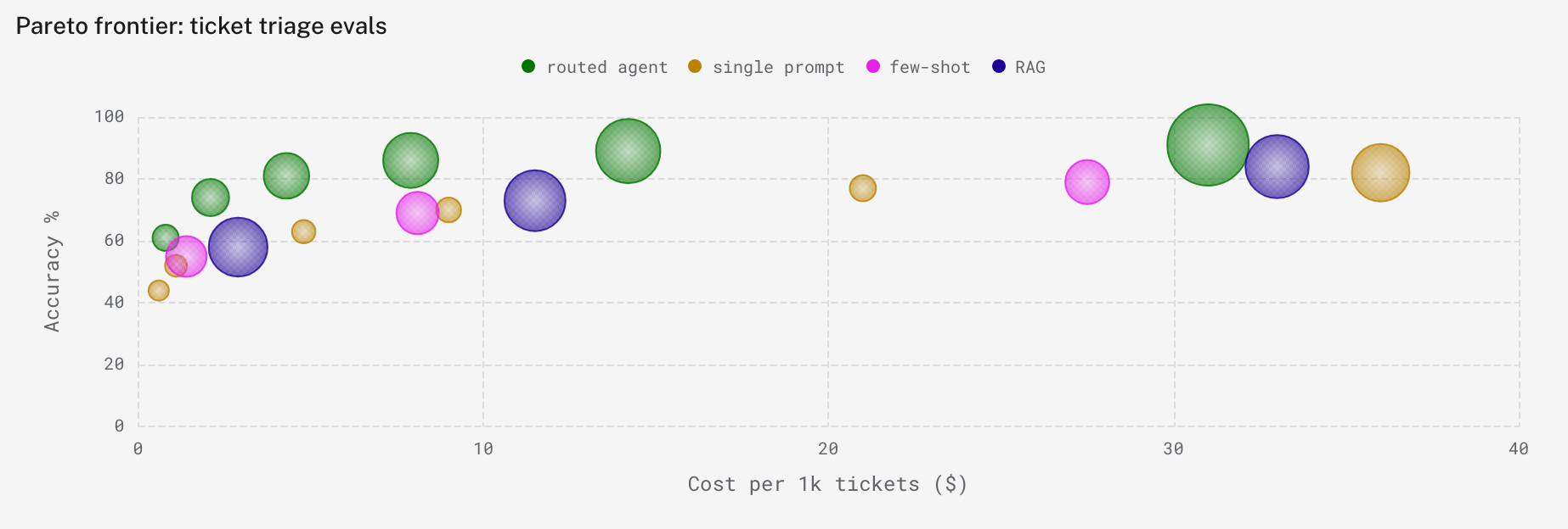
A time series averages rows into buckets, and a bar chart collapses them into one bar per category. Scatter charts plot each row of your query as its own point, so you can see how two measures trade off against each other and which rows sit apart from the rest. Plot eval accuracy against cost per case, and the configurations worth keeping form the upper-left edge of the chart. Pick the X axis column and Y axis column, color points with Group by, and use Size by to scale each point by a third column such as token count or database query count. When you leave a column unset, Logfire picks one from the column types in your query.
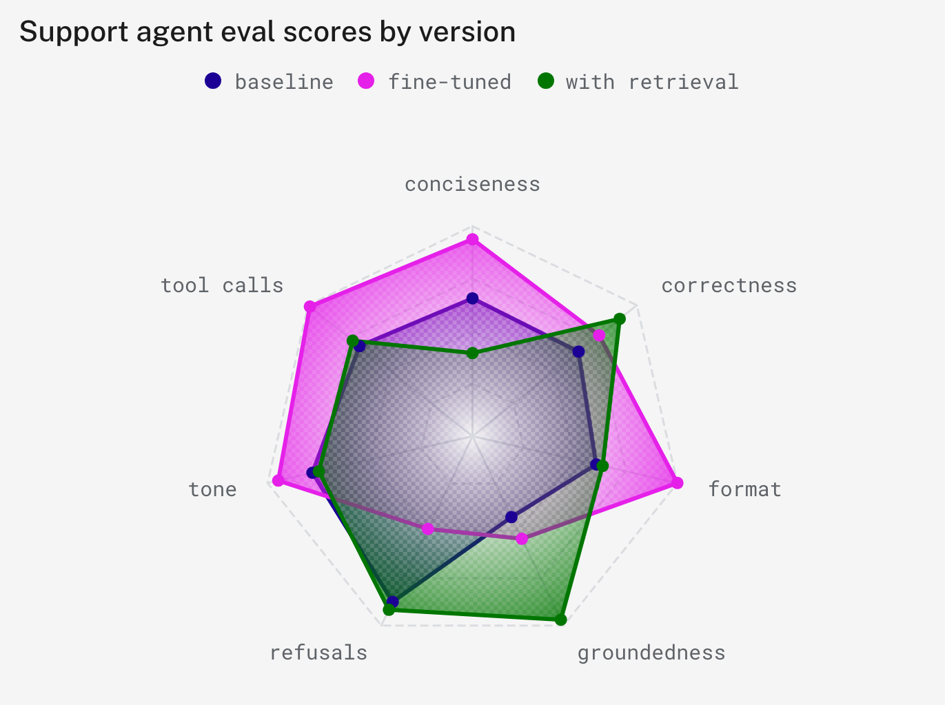
Radar charts compare several measures across the same set of categories, such as the average score each evaluator gives every version of an agent. Each row of the Axes column becomes a spoke, and each numeric column becomes a polygon. For long-format results, like one row per evaluator and agent version, set Group by and Value column instead. Axis scale either shares one maximum across all spokes or scales each spoke to its own maximum, which keeps a small measure readable next to a large one.
Where to find it: add a panel to a custom dashboard and choose Scatter chart or Radar chart as its type. Open Dashboards in Logfire. See the dashboards guide.